

Project Statement
The concept behind this project was to create a mobile app that would provide audio tours for the Minneapolis Institute of Art. Accessibility was top-of-mind for this idea, with the primary function being audio tours with read-along transcripts offered in a wide variety of languages. As a regular visitor to the museum, I found the lack of other languages on information plaques to be a problem. Additionally, the provided audio tours could be very confusing, with the audio switching to the next piece in the queue without being able to track where it is in the gallery. I wanted to set about creating a solution for these issues.
Storyboards - Big Picture

Ken enters the museum. He’s having trouble navigating, and finding the pieces he wants to see and learn about.

He sees an advertisement for the museum’s app and decides to give it a try.
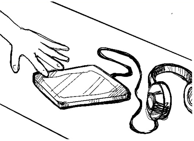
He decides to pick up the audio tour equipment, but it’s bulky and doesn’t provide much guidance.
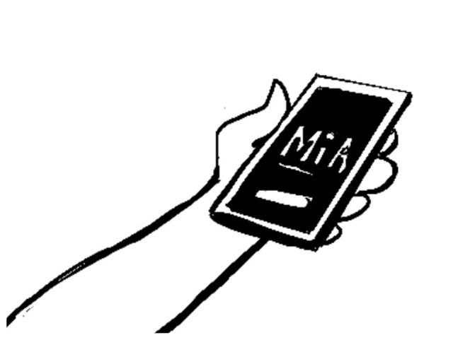
Ken then downloads and opens the app.

When he does find a piece, he notices the description plaque is limited and only in English.

Within minutes, Ken navigating the museum and learning about the pieces he finds interesting.
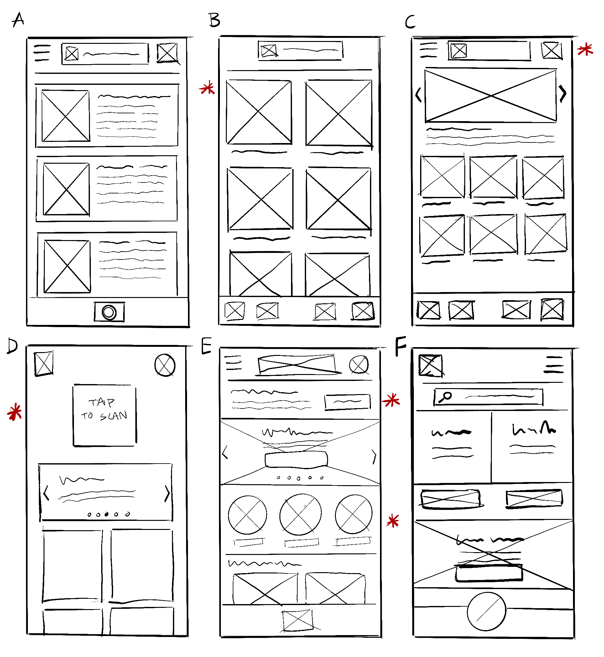
Storyboards - Feature Specific

User finds the museum app and taps to open it.

User is taken to the homepage, user taps on the camera icon.

New user creates an account or existing user logs in.

User scans the QR code for the piece they want to see and learn about.

User chooses their preferred language for text and audio.

The user is taken to the artwork page which has a button to play audio, as well as the transcript of the audio.
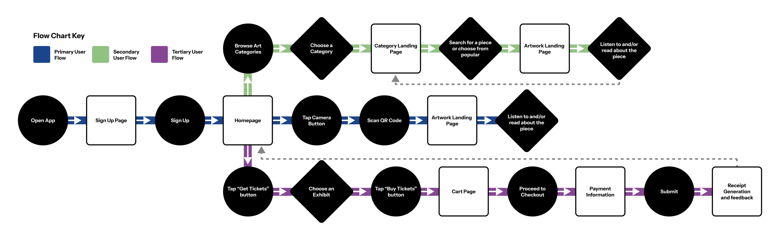
User Flow
The user flow needs to be as straightforward as possible. Users will be moving around the museum, possibly while holding other items in their hands. With this in mind, getting to the most commonly sought after information with minimal effort was key. Incorporating the accessibility factor was also paramount, as one of the core principles of this design would be inclusivity. A wide variety of languages with audio and text descriptions, high contrast visuals with larger font sizes and icons.
Wire Frames - Paper
Moving into the wire framing phase, I started by looking at a variety of apps I use regularly as reference. These apps were chosen based on their ease of use while being presented in a very visually digestible interface. I began to extrapolate their elements and start identifying layouts that would work well for the purpose of the app.
Wire Frames - Low Fidelity
While exploring layouts, the initial designs would start to evolve as new pain points and more efficient ways to organize the information were discovered. This is also the stage in which I took a wider look at the app, deciding to add more functionality like purchasing tickets to special exhibits.
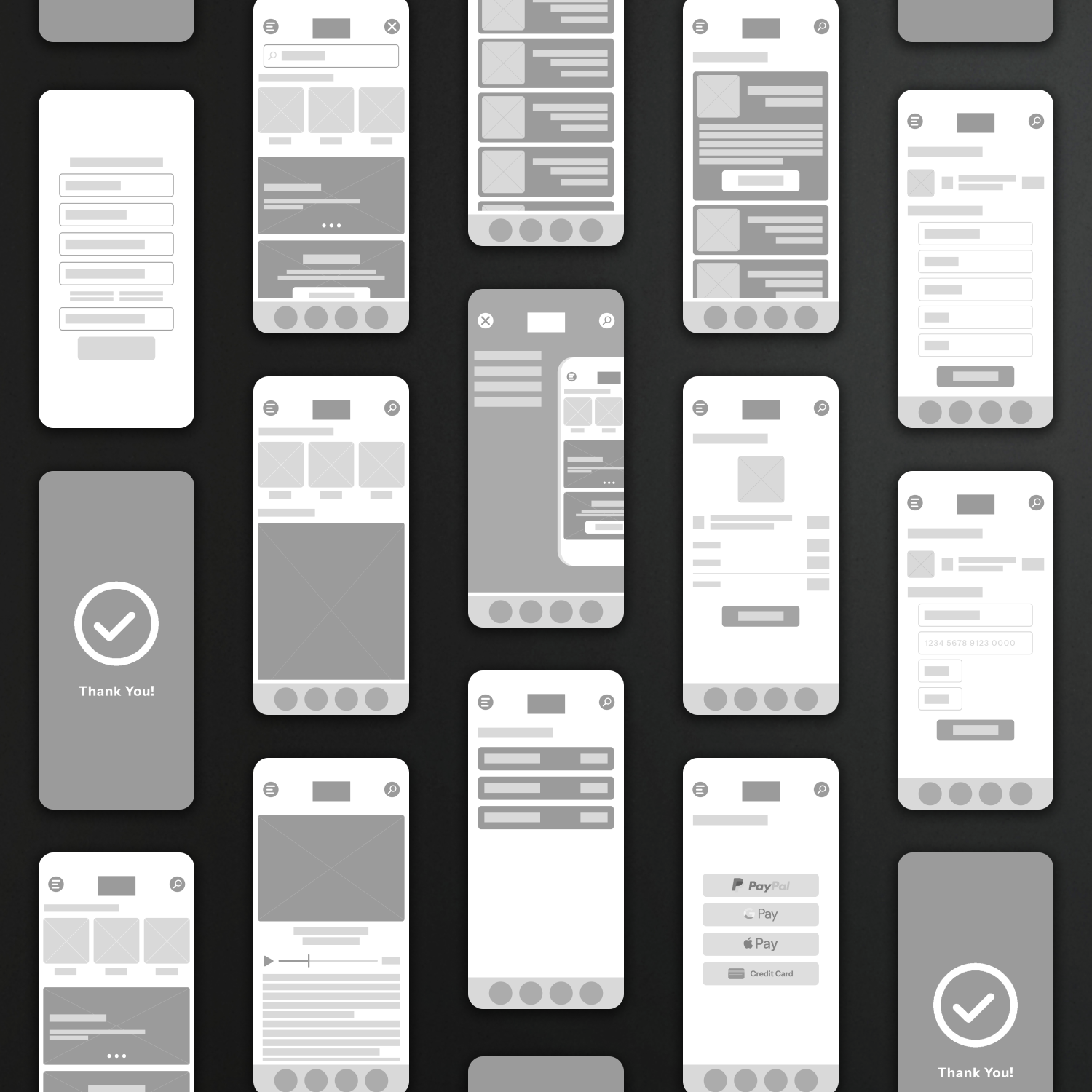
Page Structure
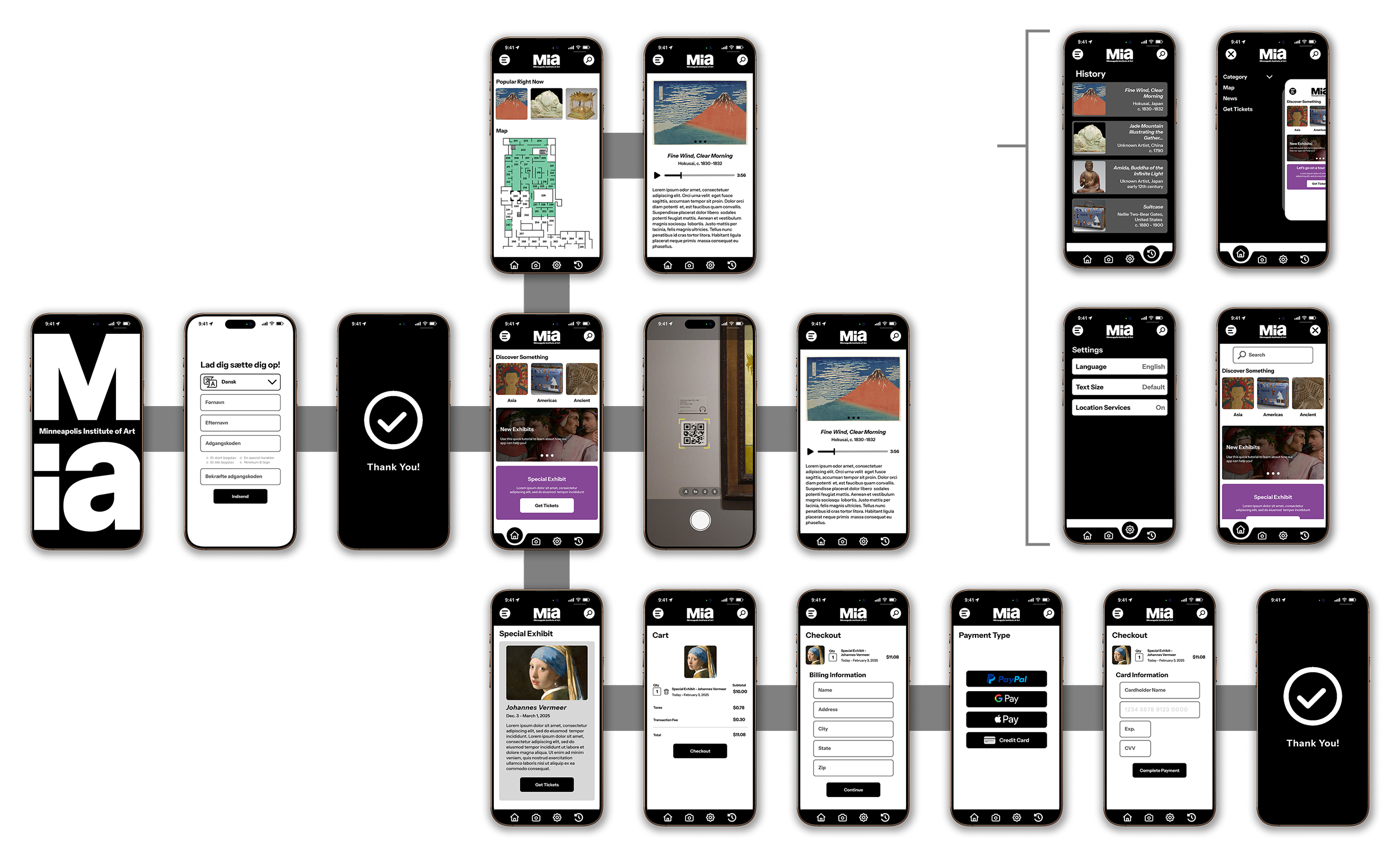
The app is designed with 4-pixel increments in mind, opting for a 12-pixel minimum. Primary buttons are set to 60px and secondary buttons at 48px.

Wire Frames - High Fidelity
Diving into the high fidelity iterations of this app, I started to look at exactly how the final design would come together. I opted for a high contrast look that would fit within the accessibility directive of the app.