

Project Statement
I love pizza. It is my vice and I wouldn’t have it any other way. As someone who has grown up in Minneapolis and loves pizza, I also love Pizza Lucé. I have used their site to order relatively often, I started to find things that could really improve the user experience. Increasing contrast ratios and making certain areas of the site easier to visually digest and interact with were my primary goals.

First Steps
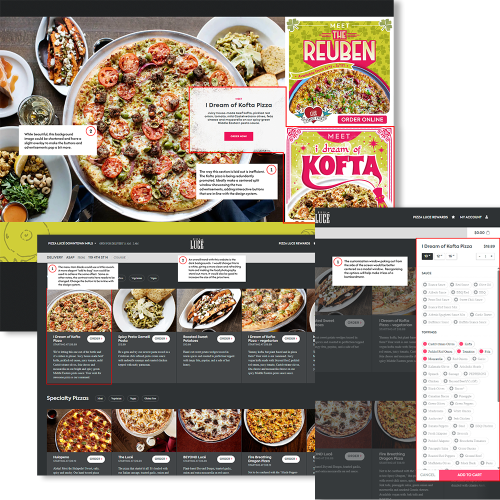
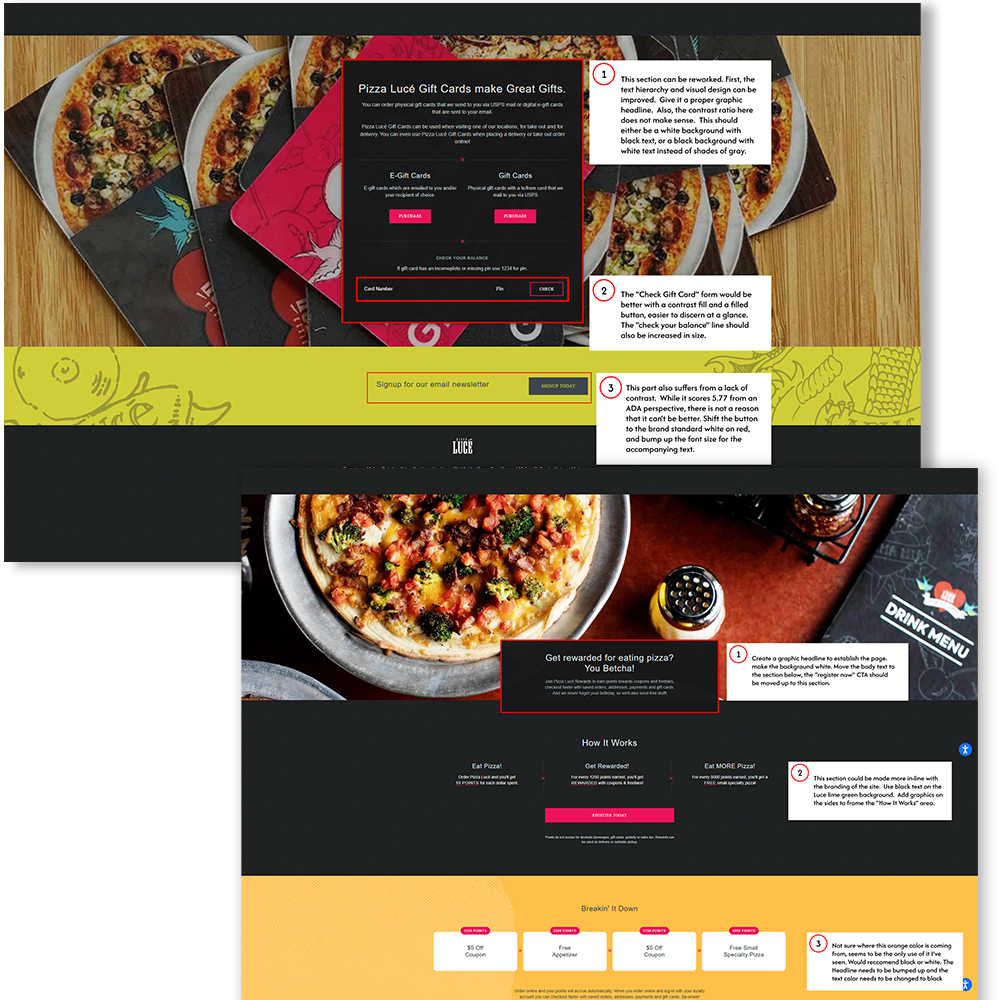
After defining the problem areas that I wanted to address, I began to audit the website. I wanted to focus on problem areas that could be improved both functionally and aesthetically. Screen capturing pages for reference and making notes on what can be improved and why.

Initial Wireframing
Referencing my notes from the audit, I began creating the low-fidelity wireframes. With these new designs I am implementing UX standards when it comes to spacing and thinking of the overall responsiveness of the site (which is sorely lacking on the current iteration). The system I am using is helping to give more visual breathing room and cleaner organization of sections, which will help users to interact with the site more effectively.

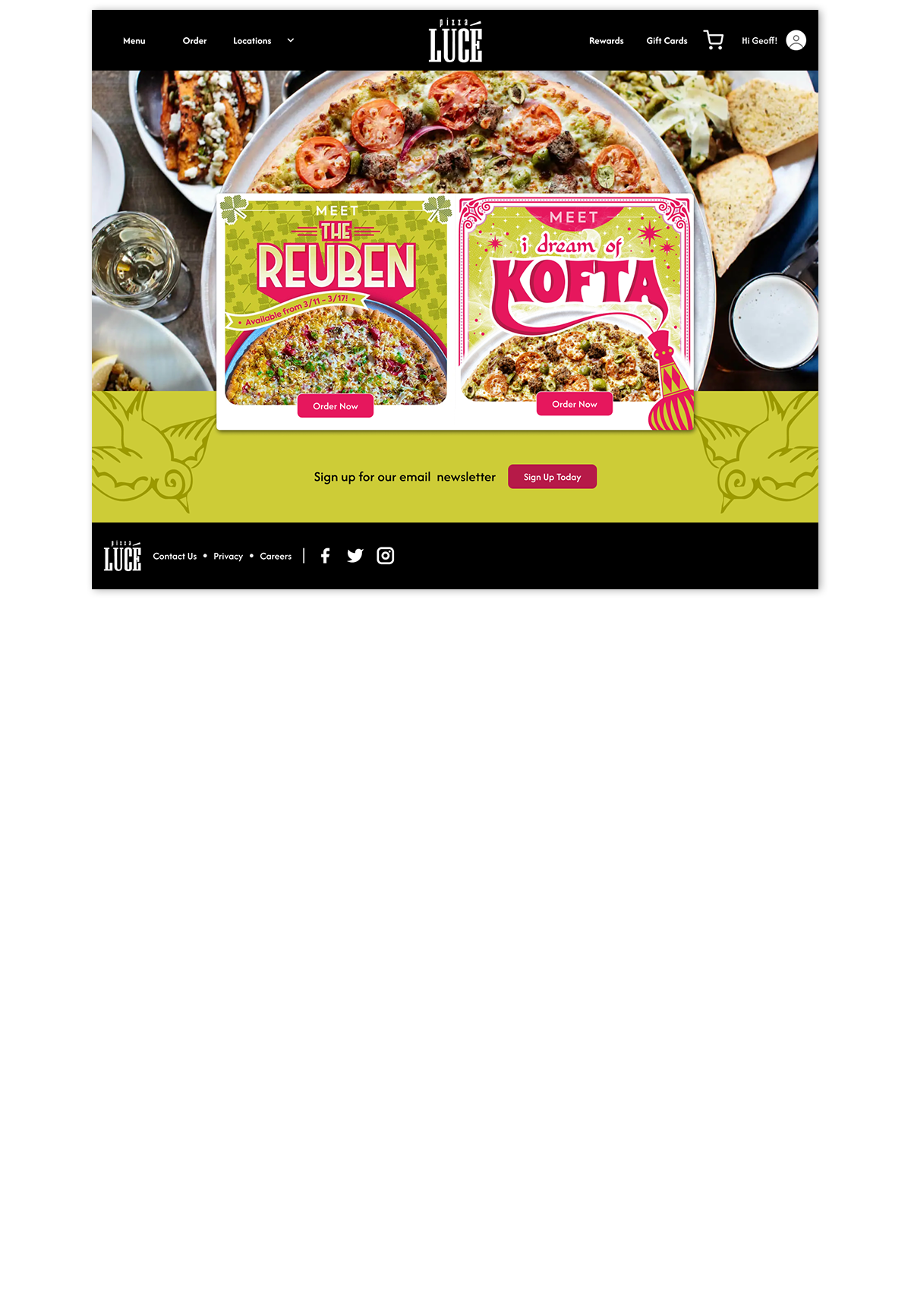
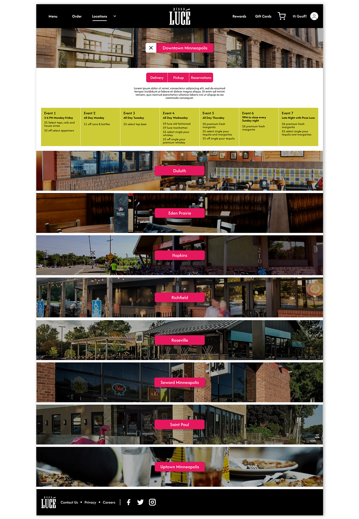
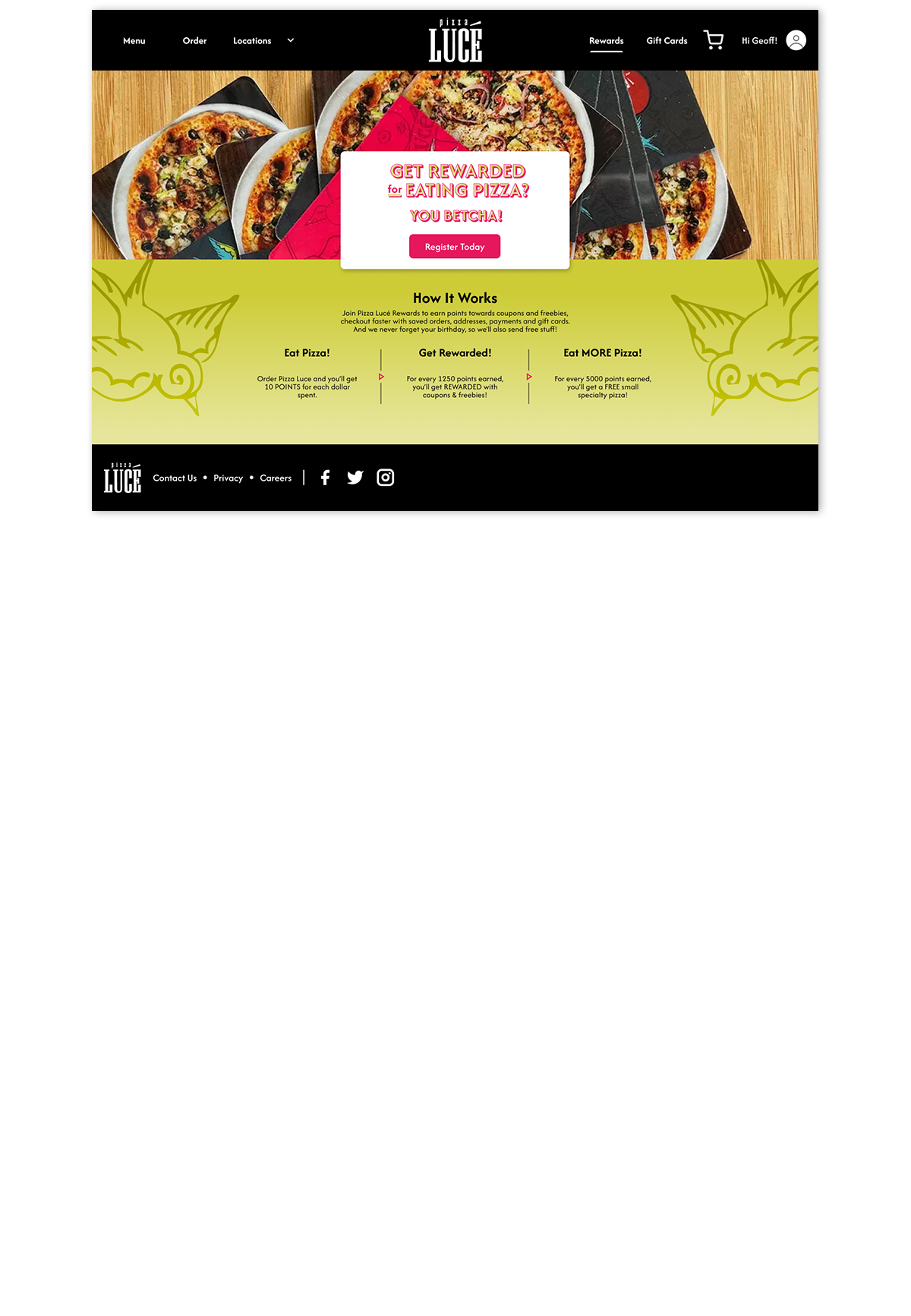
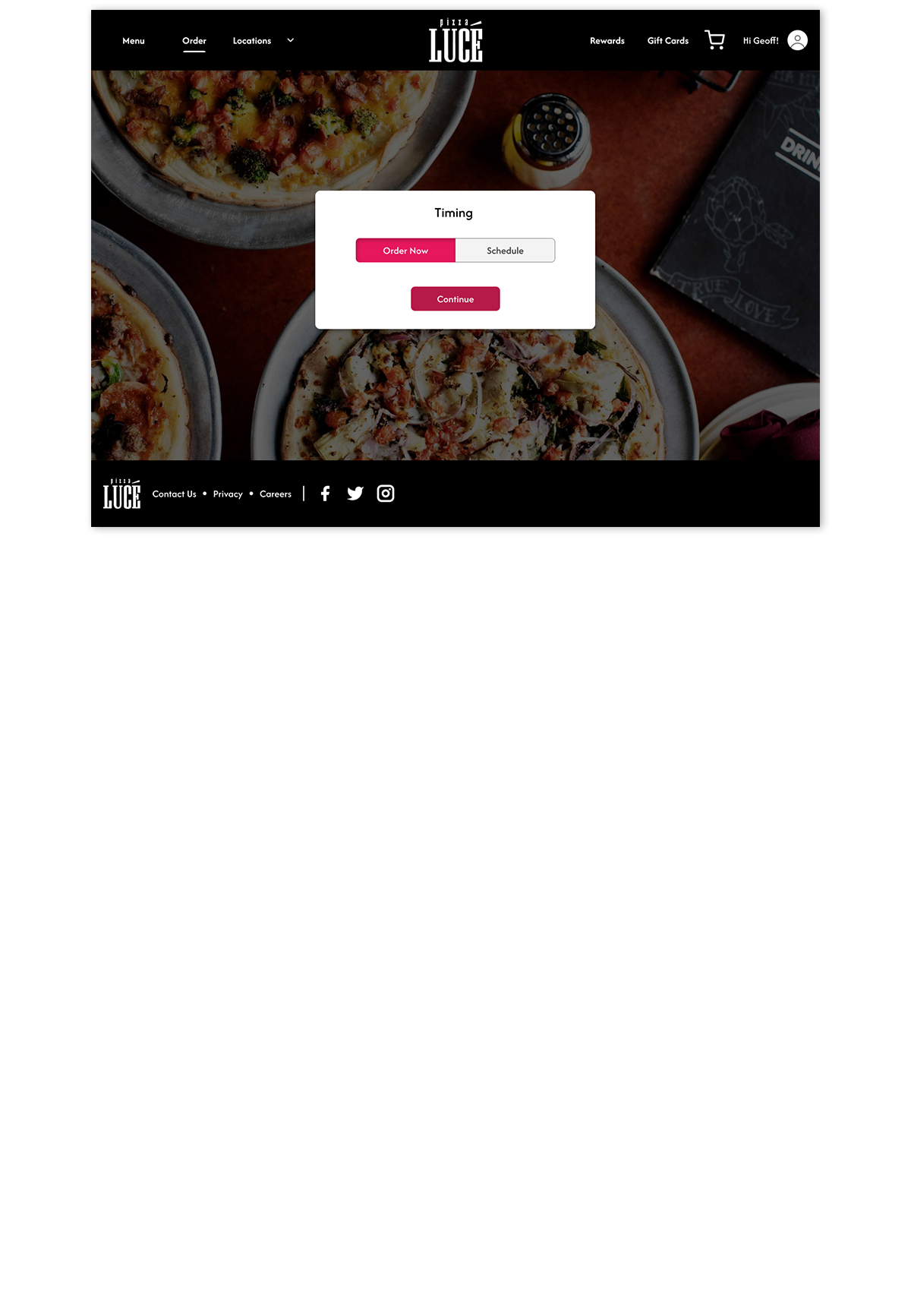
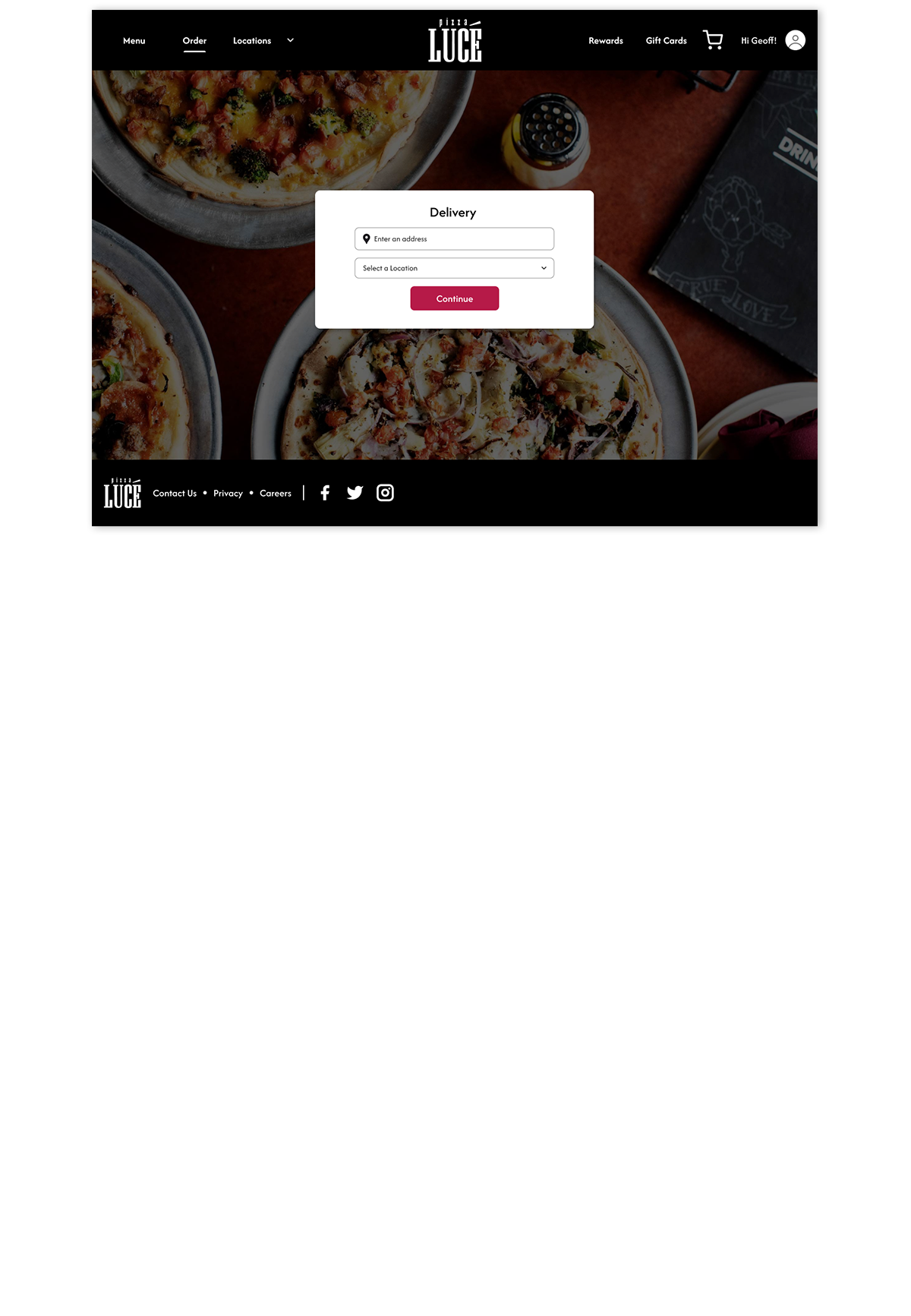
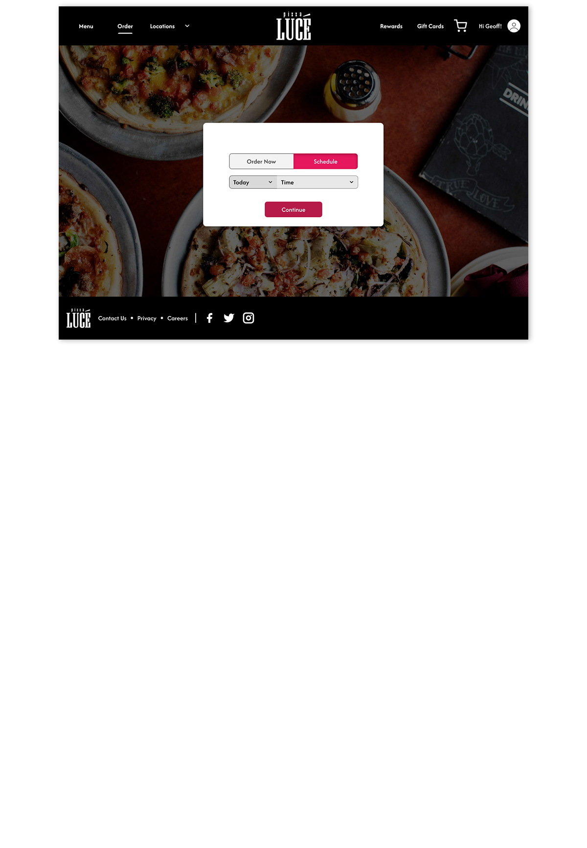
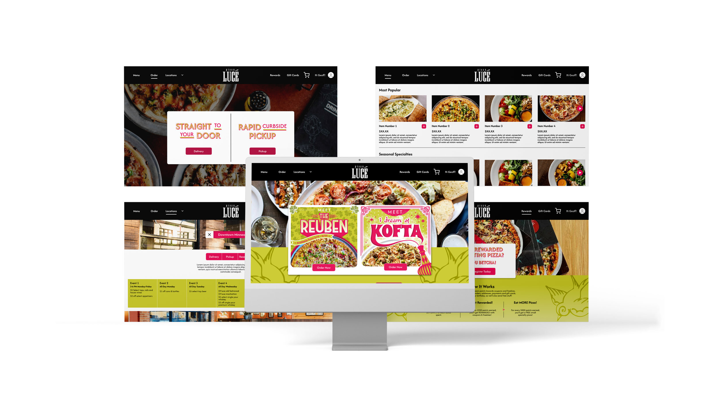
Final Designs
With the initial wireframes laid out, the next step was creating the high-fidelity mockups. Leveraging my background in graphic and web design, I wanted to apply a more visually appealing look. I extrapolated some of Pizza Lucé’s brand graphics and their color system and applied it to the site as a whole.