

Project Statement
Showstopper Vintage was looking for a more complete visual toolkit to have for collaborating with vintage markets and developing in-house designs for packaging and web/social.
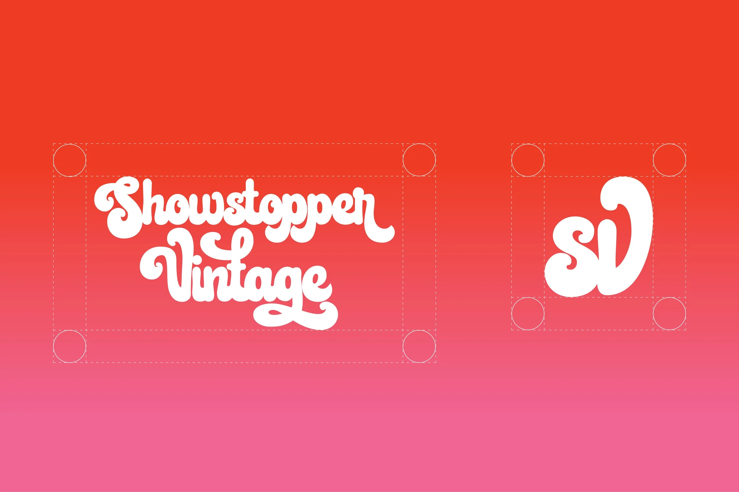
Logo Usage Guidelines
While Showstopper’s logo had been designed already, it’s guidelines had not been established. One of the purposes of this project was to add professional standards to the visual branding of the company. A variant square logo was also created for badging and smaller digital spaces.

Color Palette
Showstopper is all about the expression of oneself through color. Warm and welcoming hues like bright tangerine and effervescent pink lend themselves to establishing this sense of fun and inclusion.
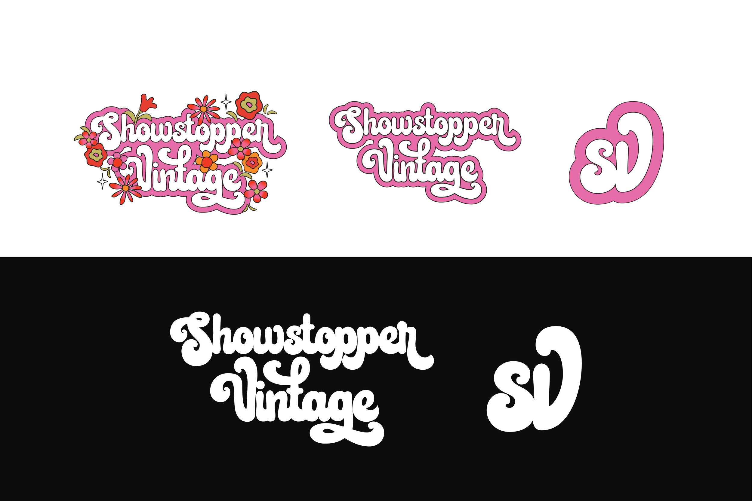
Graphic Elements
Showstopper is all about the expression of oneself through color. Warm and welcoming hues like bright tangerine and effervescent pink lend themselves to establishing this sense of fun and inclusion.


Business Cards & Tags
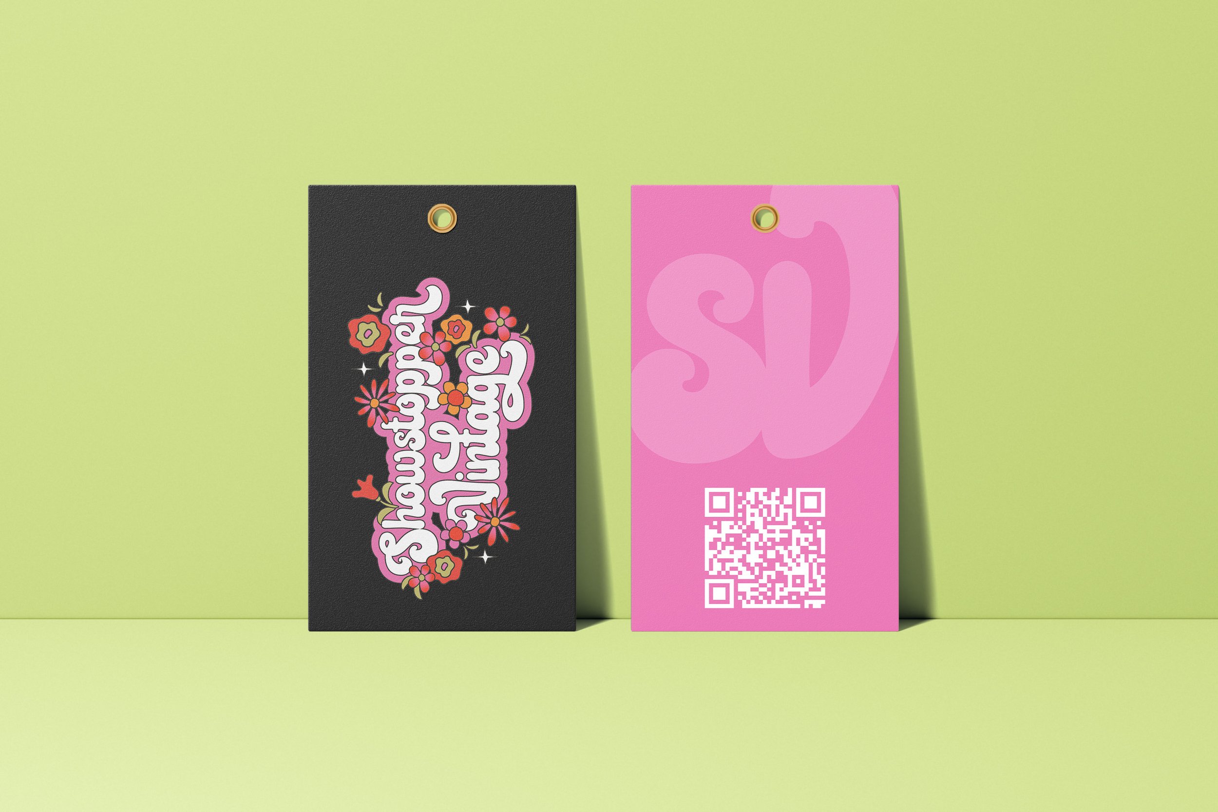
While re-working the visual guidelines, I found out the founders did not have updated business cards. Their old cards were not reflective of the visual direction the brand was moving in. I wanted them to have a more modern feel with the rounded corners and QR code linking to their website, while still keeping the roots of Showstopper’s aesthetic with plenty of color. I adapted the business card design to the merchandise tags below.


Packaging
I also noticed they were not using branded bags so I offered to create some concepts for different size bags. The idea behind these was to create them in limited quantities for larger market events. Customers would be walking around spreading brand awareness and creating a sense of collector value.